Severn Trent
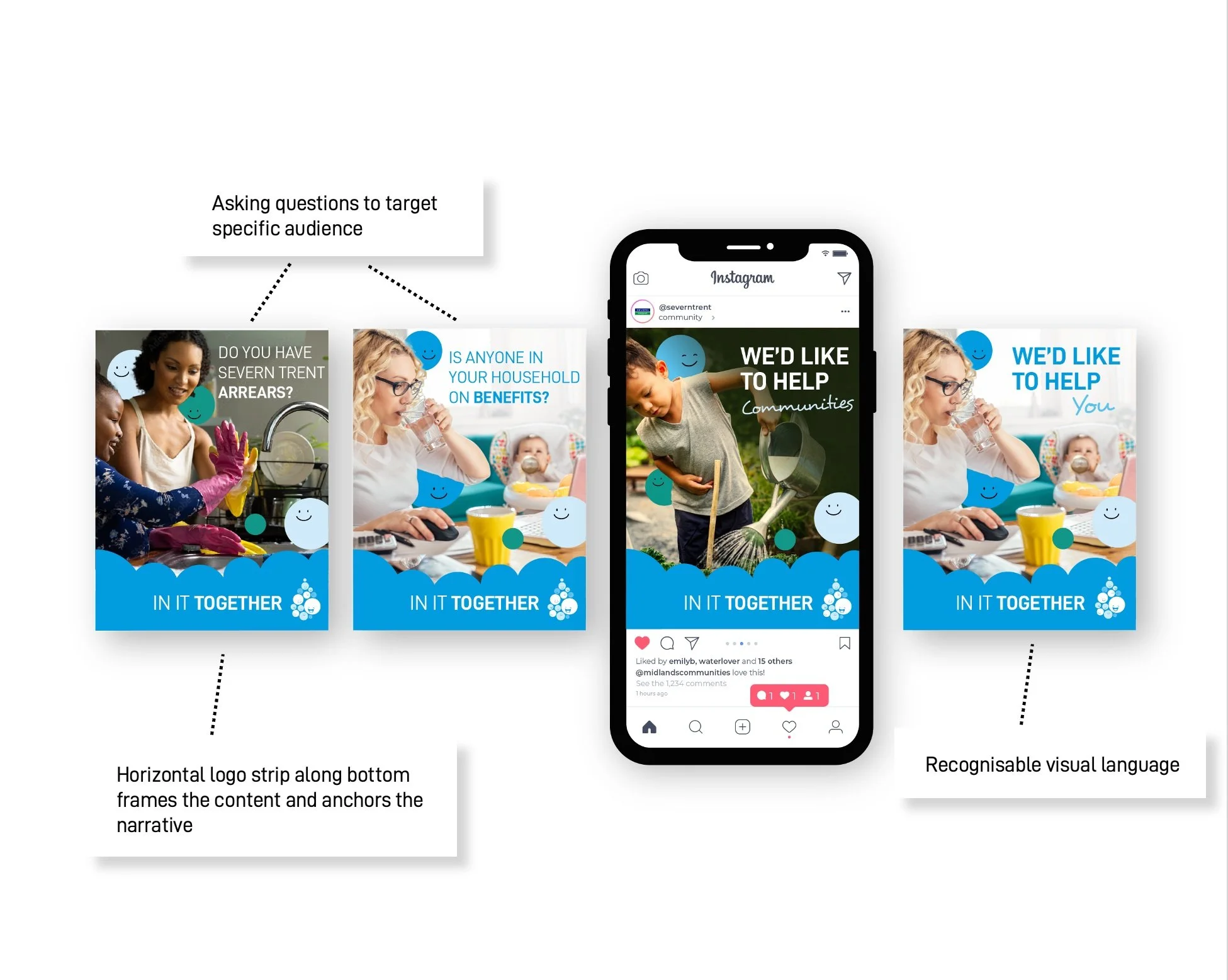
Brief to create an identity and campaign for a new initiative supporting Severn Trent's customers and communities. Naming of campaign, branding, marketing and collateral roll out.

The water drop made from lots of different faces, signifies how the customers are an integral part of Severn Trent.
The faces whilst remaining neutral of gender and race implies the diverse range of customers through the variety of size and colour.
The faces are grouped together to imply families, communities and individuals.
The faces are interacting with each other to signify an active participation and reference the 2 way relationship between Severn trent and their customers.
Blue and green colour scheme chosen for it’s instant identification as water.
Colour scheme made from 2 primary colours and 2 tints.


